Four days after releasing a video that showed the removal of U.S. Soccer's address plate outside its Chicago headquarters, the wait is over for the federation's new look.
— U.S. Soccer (@ussoccer) February 26, 2016
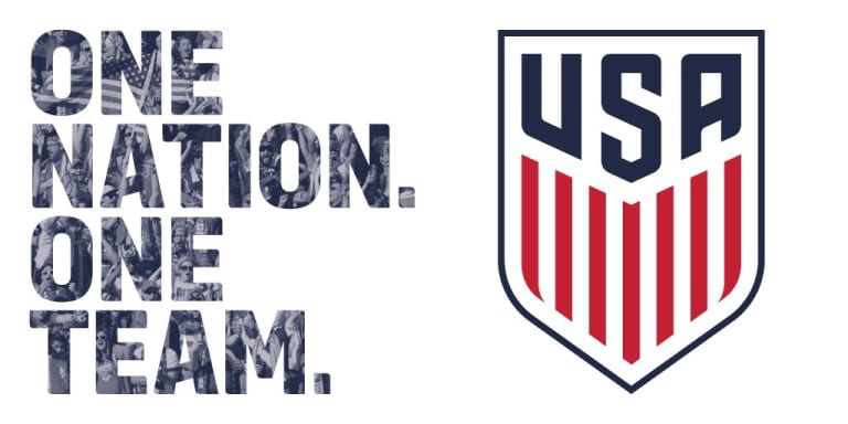
A new crest was unveiled with the design taking a step towards minimalism. The crest, which had remained largely unchanged since 1995, dropped its soccer ball graphic, opting instead for a simple navy and red concept with 'USA' block letters and 13 vertical stripes. The updated crest will debut on new jerseys to be worn by the men's national team in World Cup qualifying matches against Guatemala in March.

Are you all in on the new look, or are you already feeling nostalgic for the logo of the past? Let us know in the comments below!


